 July 19, 2014
A copy of “Magnum Contact Sheets” was in my Santa Sack last Christmas. Who would have thought Santa was that clued up on photography? The book presents some of the most famous Magnum images and pairs them with the contact sheet it was selected from. The photographer also gives some commentary around the photo and selection rationale.
You can purchase the book here.


It gives the reader a chance to understand the thinking process behind the image. Like my last rolls of Neopan 1600, I have been reading the book sparingly. Just one photo at a time to ensure I give myself every opportunity to walk in the shoes of these wonderful photographers for a moment.
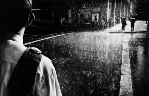
The first image I just couldn’t go past was Trent Parke’s “Summer Rain”. It was a pleasant surprise to find out it was shot in Sydney.
Parke talks about spending enough time in a city to know when different shots might happen under the right circumstances. All kinds of circumstances – weather, cultural, events etc.
In the case of “Summer Rain” he was visiting his usual favoured city locations in Sydney, when a summer thunderstorm came through. Parke’s masterstroke was knowing from experience where strong light might break through into a rain soaked scene. He ran across the CBD until he got to the corner he had in mind.
The main subject in the left of frame is often mistakenly thought to have a backpack strap over his shoulder. It is actually his tie – flipped over from running through the rain.
Parke talks about is time in Sydney “always standing, watching, and waiting on street corners for something magical to happen”.
What Makes it a Great Image?

The “over the shoulder” perspective directs the the viewer towards the exit point of the image – top right. It is a very natural progression. People generally “enter” a visual on the left and exit right.
The direction is supported by the traffic lines that continue to draw the eye from the subject on the left towards the top right. The contrast between the road and the line is aesthetically pleasing.
The rain is clearly falling in the frame. There is a sense of anticipation. The subject on the left has a clearly defined path he is going to have to travel – through the downpour. He is already a little dishevelled with his tie coming over the shoulder. The pedestrian crossing almost looks like a landing strip.
The light is falling on the subjects on the right in the circle. The light then gradually falling off in a roughly concentric circle as marked up. It highlights the exit point and main silhouetted figures at the destination point. The objective of the guy with the tie is clear – he needs to cross the wet and raining road.
The figure to ground ratio for the figures on the right is contrasty and helps break them clear of other visual clutter.
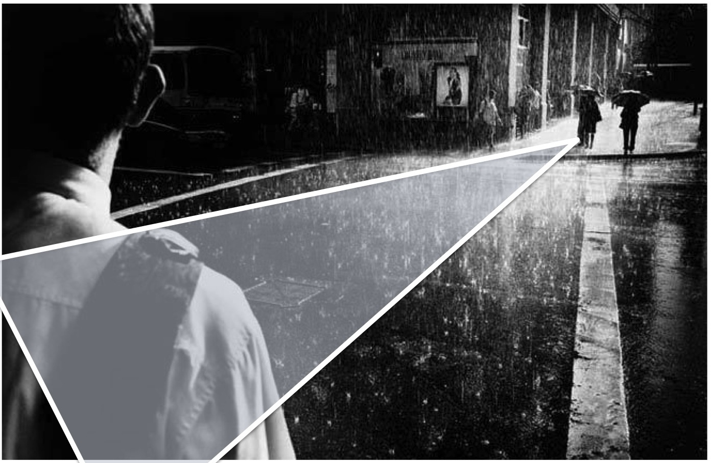
To simplify the aesthetic even a little more – the relationship between the “tie guy” on the left and the silhouetted figures on the right forms a rough triangle. Triangles are good. Hmmm, very technical…
Summary of Learning
1. Stand – Watch – Wait :
Something magical will happen if you are patient. Find the spot, wait for the shot.
2. Know Your Locations :
Mentally catalogue locations as you discover them. Think about what time of day the light is best, the kind of angles that work etc. Or you could record them visually? Just know where to go when different sets of circumstances occur. For example, when it rains, I have a doorway in Degraves St that I always know is a winner!
3. Be Decisive
Parke talks about running across the CBD to get to where he thought an opportunity would happen. Once you recognise the opportunity, be single minded and get to it. Don’t faff about. About a month ago, I was looking out the window mid/late Saturday afternoon and thought the light looked extra special. One of my photography buddies, Cos, even posted about it on Facebook!

I saw his post. And just kept wearing an ass groove into the couch, watching Fox Footy. I thought, “yah, I’ll get out tomorrow and the light will be just as great”. It wasn’t and I didn’t…
For the record, here is the contact sheet that the image was selected from.


Trackbacks/Pingbacks
[…] Parke’s work has a distinctive style. Mostly black and white, utilising high contrast images, often shot in low light or at night to enhance this effect. I have talked about one of my favourite Parke images back here. […]
LikeLike